A small-batch house, positioned like it's already been discovered
A concept store for a small-batch fragrance house: press styling, a global footprint map and a gifting-first checkout, built to feel established on day one.
Read the conceptA concept brand site built around exactly two fragrances, Hayat and Rooh. Presented bilingually in English and Arabic. With a catalogue this small, there is nowhere to hide: the site either makes two products feel like a considered house, or it looks thin.
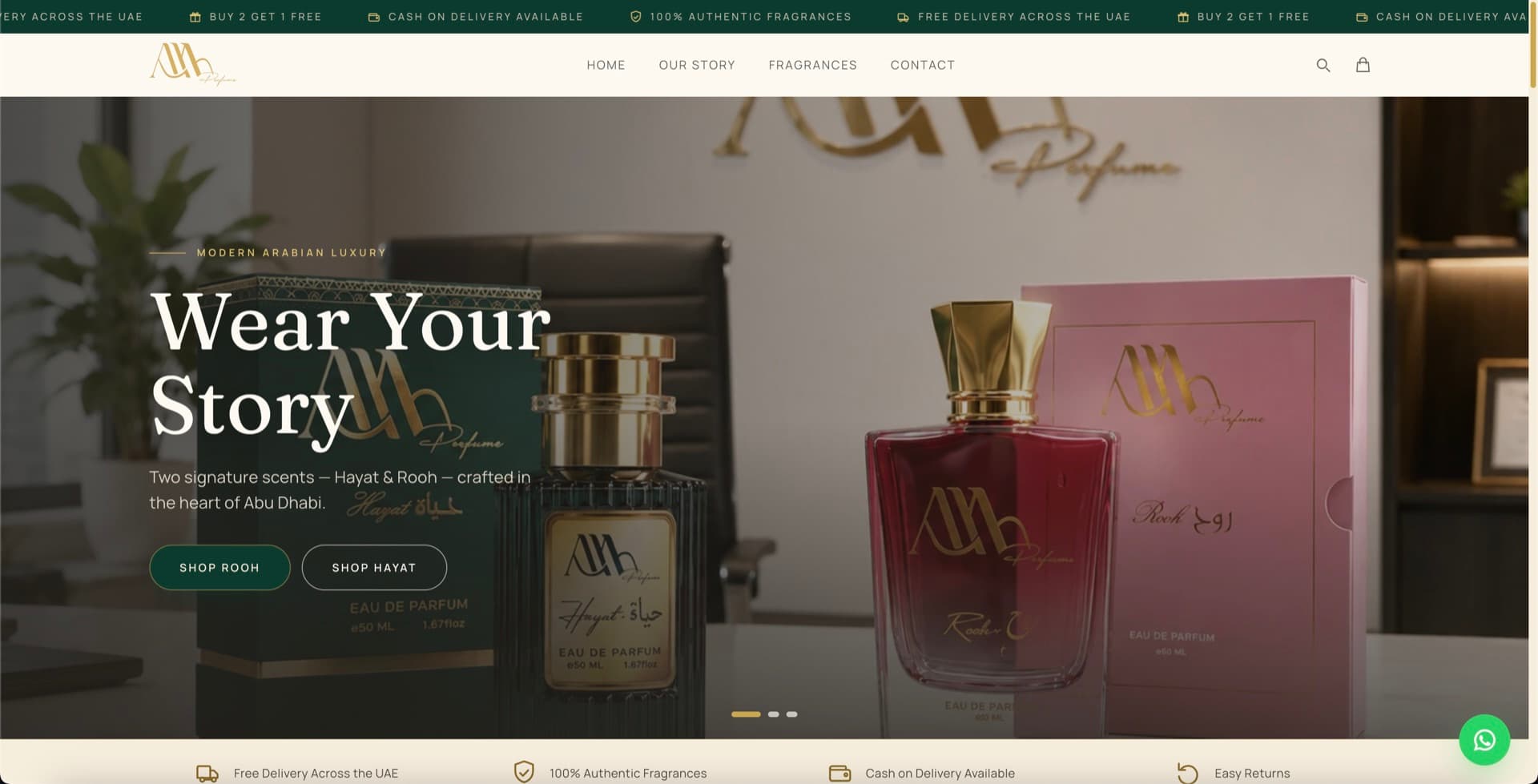
A two-product range cannot lean on browse mechanics, because there is nothing to browse. What it can do is give each fragrance the depth a catalogue page never affords: the intent behind it, the notes, who it is for, how it wears through a day.
The concept treats each scent as a chapter rather than a listing. Scrolling becomes narrative rather than navigation, and the absence of a grid reads as focus instead of scarcity.
Supporting English and Arabic properly is not a translation layer bolted onto a finished design. Right-to-left reverses layout logic, so navigation, alignment and asymmetric compositions all have to work mirrored.
Type is the harder half. A pairing that feels considered in Latin can look mismatched in Arabic, where letterforms, weight distribution and vertical rhythm behave differently. The concept designs both scripts together rather than treating one as the default and the other as a port.
The concept uses a dark palette, which is easy to get wrong: contrast collapses, thin type becomes unreadable, and photography turns muddy. Getting it right means deliberate contrast ratios, weights chosen to hold on a dark ground, and imagery selected for how it behaves against it.
Each of the two fragrances given a full editorial treatment rather than a catalogue entry.
Right-to-left layout and a type pairing designed for both scripts, not ported into one.
Weights and ratios chosen so the tone reads as considered rather than merely dim.
A concept store for a small-batch fragrance house: press styling, a global footprint map and a gifting-first checkout, built to feel established on day one.
Read the conceptA concept storefront for a below-wholesale fragrance-oil retailer: 1,000+ SKUs, sample-first buying and a wholesale funnel, on Next.js and Shopify.
Read the conceptA concept brand site for an ultra-luxury UAE oud and attar house: editorial restraint, bespoke blending enquiries and a distributor programme, built on Webflow.
Read the conceptStart with a free mockup. We'll design your three main pages so you can see the direction before committing to anything.