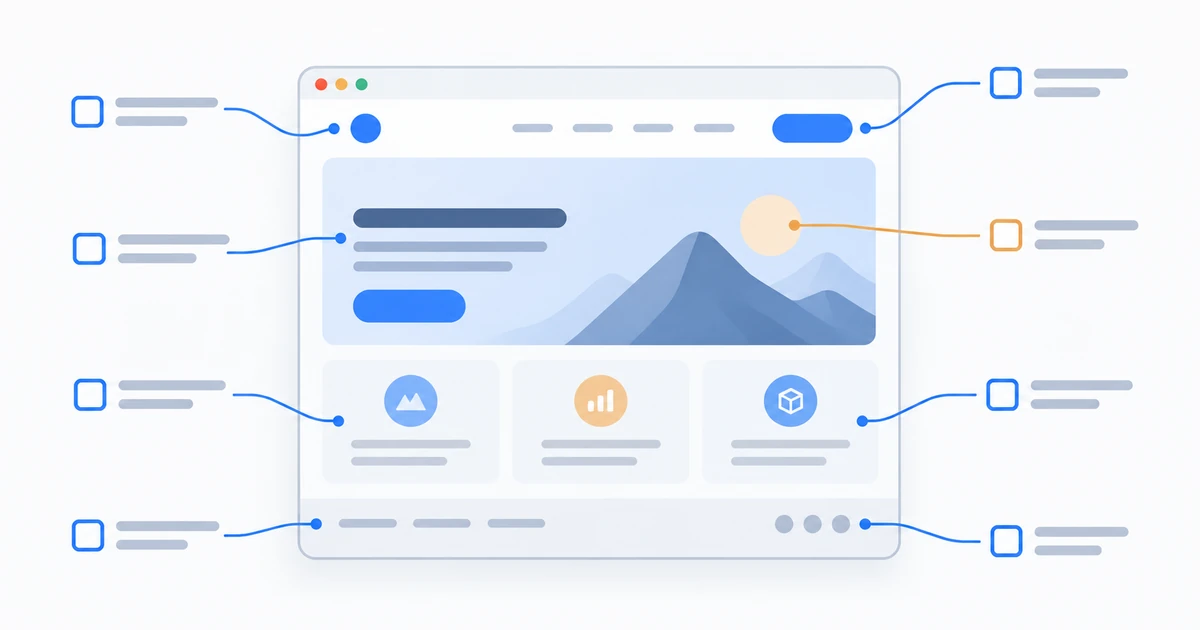
This checklist is organised by what each element actually prevents. Use it before a build to write the brief, or after one to diagnose why a site isn’t converting.
None of the twelve is difficult in isolation. Sites underperform because two or three are missing at once, and because nobody is measuring closely enough to notice which ones.
The foundations
1. A clear value proposition above the fold
Within about five seconds, a visitor should know what you do, who it’s for, and why you’re worth considering. Most business homepages fail this by opening with a company slogan instead of a plain statement of the offer.
Include: a specific headline naming the service and audience, a supporting sentence on the outcome, and one primary action. Prevents: high bounce rates from visitors who can’t tell what you sell.
2. One obvious primary call to action
Every page needs a single dominant next step. Six equally weighted buttons is the same as none. Use one visually dominant CTA per page, repeated as the visitor scrolls, plus a lower-commitment secondary option for people who aren’t ready.
Prevents: traffic that reads everything and does nothing.
3. A logical page structure
The minimum viable business site:
| Page | Purpose |
|---|---|
| Home | Value proposition, proof, primary CTA |
| Services or Products | What you offer, in the customer's language |
| About | Credibility, people, and why you exist |
| Case studies or Portfolio | Evidence the work delivers |
| Contact | Multiple ways to reach you |
| Blog or Resources | Organic acquisition and topical authority |
| Privacy Policy & Terms | Legal requirement in most jurisdictions |
Individual service pages outperform one combined services page for SEO, because each can target its own query and build its own internal links.
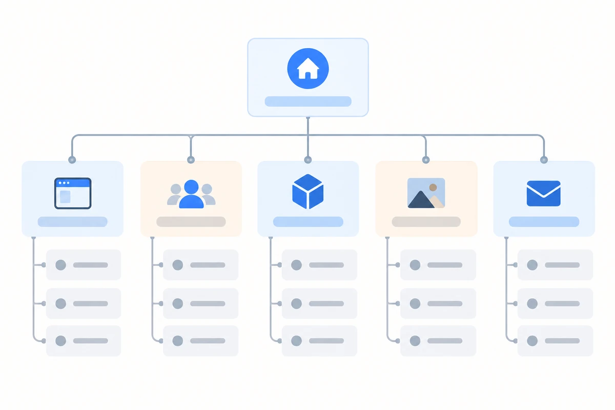
Prevents: thin site architecture that ranks for nothing specific.
Performance and access
4. Mobile-first responsive design
Mobile and desktop each take roughly half of global web traffic, per Statcounter, and Google indexes the mobile version of your site. Designing for desktop and “checking mobile later” is backwards regardless of which half is bigger this quarter.
Check: tap targets at least 44×44px, readable text without zooming, no horizontal scroll, forms usable one-handed, menus reachable with a thumb. Prevents: losing half your audience and your mobile rankings simultaneously.
5. Fast load times
Speed affects both conversion and rankings. Target the Core Web Vitals thresholds: LCP under 2.5 seconds, INP under 200ms, CLS under 0.1, all three checkable free in Google PageSpeed Insights.
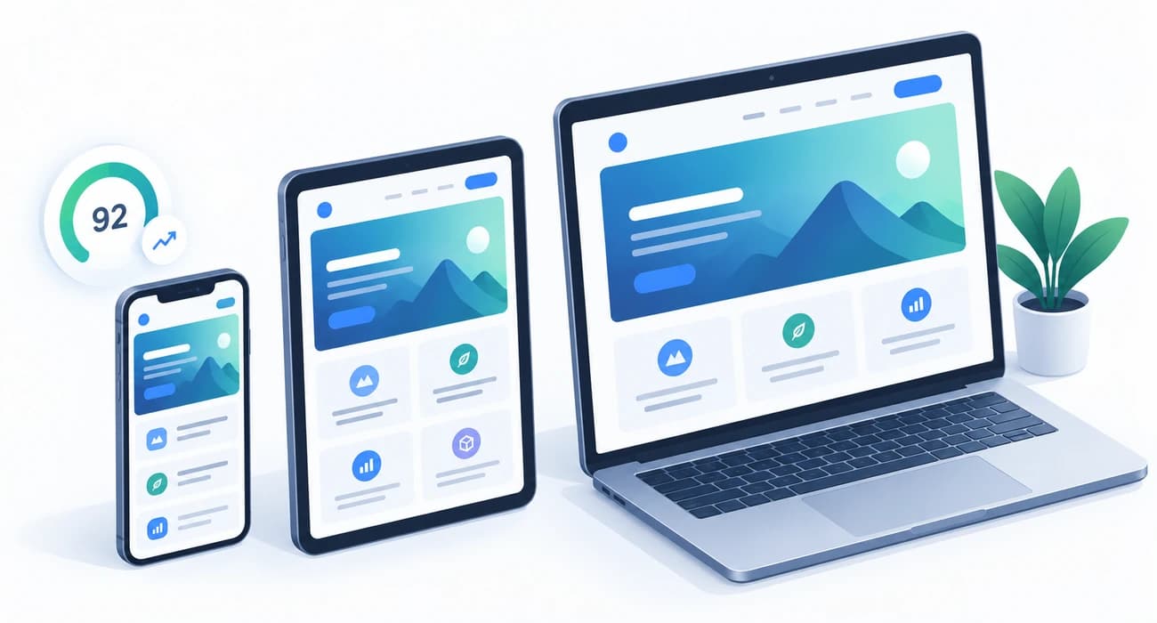
Do: compress images and serve WebP, set explicit image dimensions, lazy-load below-fold media, enable caching and compression, use a CDN, limit plugins, defer non-critical JavaScript. Prevents: the substantial share of visitors who abandon slow pages before seeing anything.
6. Accessibility
Accessible sites serve more people, and in many jurisdictions accessibility is a legal requirement rather than a nicety. Aim for WCAG 2.2 Level AA.
Baseline: 4.5:1 text contrast, descriptive alt text on meaningful images, full keyboard navigation with visible focus states, labelled form fields, semantic headings in order, captions on video, no information conveyed by colour alone. Prevents: excluding users with disabilities, and legal exposure.
Credibility
7. Visible contact information
Phone number, email and physical address where applicable — in the header or footer, on every page, as real selectable text rather than an image. A contact form alone signals that you’d rather not be contacted.
Prevents: losing customers who want to talk to a person, and weakening local SEO signals.
8. Trust signals
People buy from businesses that look real. Include genuine customer reviews with names, case studies with actual outcomes, client or partner logos, relevant certifications, team photos of real people, and a clear refund or guarantee policy.
Avoid: stock photos posing as your team, unattributed testimonials, and fabricated review counts. Modern buyers detect these immediately, and fake reviews create regulatory risk. Prevents: the credibility gap that stops qualified visitors from converting.
9. Professional, consistent visual design
Professional design isn’t about being elaborate. It’s consistency: one typeface pairing, a defined colour palette, a consistent spacing scale, aligned elements, deliberate white space, and image quality that matches across the site. Inconsistency reads as amateurism faster than any single ugly element.
Prevents: visitors discounting the business based on presentation.
Technical requirements
10. Technical SEO fundamentals
Rankings start with being properly readable by search engines.
Baseline: unique meta title and description on every page, one H1 per page with logical heading hierarchy, descriptive keyword-relevant URLs, image alt text, an XML sitemap submitted to Search Console, a robots.txt, canonical tags, structured data (Organization, LocalBusiness, Article as applicable), internal links between related pages, and 301 redirects for any changed URL. Prevents: publishing quality content that never gets found.
11. Analytics and measurement
You cannot improve what you don’t measure. Install analytics and Google Search Console before launch, not three months after.
Set up: analytics with conversion goals or events for every meaningful action, Search Console, form submission tracking, and — if you run ads — conversion tracking. A simple heatmap tool is a worthwhile addition. Prevents: redesigning based on opinion instead of evidence.
12. Security and maintenance
Security baseline: SSL/HTTPS across the whole site, automated backups stored off-server, up-to-date CMS and plugins, strong admin passwords with two-factor authentication, spam protection on forms, and a privacy policy reflecting how you actually handle data.
Maintenance plan: scheduled updates, monitoring for downtime and broken links, periodic content review, and a named person responsible. Sites decay without this, and the most common cause of a hacked site is an unmaintained one.
Common mistakes this checklist prevents
- Writing about yourself instead of the customer. “We are a leading provider of innovative solutions” says nothing. Lead with the customer’s problem and your specific outcome.
- Auto-playing video or audio. It increases bounce rate and creates accessibility problems.
- Carousels on the homepage. Visitors rarely see past the first slide, and each slide dilutes the message. One strong message outperforms five rotating ones.
- Long forms. Every additional field reduces completion. Ask for what you need to start a conversation, not everything you’d eventually like to know.
- Unclear navigation labels. “Solutions”, “Offerings” and “Our Approach” make people guess. Plain labels win.
- Text over busy images. Fails contrast requirements and reduces readability, especially on mobile.
- No 404 page. A helpful 404 with search and navigation recovers visitors that a dead end loses.
- Ignoring page speed after launch. Sites get slower as content, plugins and tracking scripts accumulate. Re-test quarterly.
The pre-launch checklist
Run through this before going live:
- Verify content and metadata. Every page has a unique title and meta description, all placeholder text and images are gone, and the copy has been proofread by someone other than the writer.
- Test functionality. Every form submitted end to end including the confirmation email, and every link checked — footer and inline included.
- Test across devices and browsers. Real iOS and Android devices, plus Chrome, Safari, Firefox and Edge. A resized browser window is not a device test.
- Confirm technical setup. SSL active with no mixed-content warnings, analytics and Search Console installed and verified, XML sitemap submitted, and 301 redirects mapped for every changed URL if this is a redesign.
- Check performance and accessibility. PageSpeed Insights on mobile and desktop, then an automated accessibility scan followed by a keyboard-only pass.
- Secure and back up. Automated off-server backups with one restore actually tested, two-factor authentication on admin accounts, and the privacy policy, terms and cookie notice published.
The favicon and social share images are the two that get forgotten most often, because nothing on the site breaks without them — they only show up the first time somebody shares a link.
Frequently asked questions
What pages should every business website have?
At minimum: home, services or products, about, contact, and a privacy policy. Most businesses should add case studies or a portfolio for credibility, individual pages for each core service, and a blog for organic acquisition.
What makes a website look professional?
Consistency more than elaboration — one typeface pairing, a defined colour palette, a consistent spacing scale, aligned elements, quality images and generous white space. Inconsistency signals amateurism faster than any single design flaw.
How important is mobile responsiveness?
It is essential. Mobile and desktop each account for roughly half of global web traffic, and Google indexes the mobile version of your site, so a poor mobile experience harms both your audience reach and your rankings at the same time.
What are Core Web Vitals and what scores should I aim for?
They are Google's page experience metrics. Aim for Largest Contentful Paint under 2.5 seconds, Interaction to Next Paint under 200 milliseconds, and Cumulative Layout Shift under 0.1. You can check all three free in Google PageSpeed Insights.
Does my website need an SSL certificate?
Yes. HTTPS is expected by browsers, which warn visitors on unencrypted sites, and it is a confirmed ranking signal. Free certificates through Let's Encrypt are included with most modern hosting.
What are the most common website design mistakes?
Writing about the company instead of the customer, homepage carousels, auto-playing media, overly long forms, vague navigation labels, text placed over busy images, and no measurement in place to identify any of these problems.
How often should a website be updated?
Security and plugin updates monthly at minimum. Content should be reviewed quarterly, and a meaningful design or structural refresh is typically needed every three to five years as expectations and technology shift.
Conclusion
Work through the list against your current site and be honest about the gaps. In most cases, fixing the two or three weakest items produces a bigger return than a full redesign would, at a fraction of the cost.
If you are about to commission a build, this list doubles as the brief. Handing it to a developer turns most of the vague parts of a website project into things that can be checked — which is the hard part of knowing who to hire.
Want a second opinion on where your site stands? Tell us the URL on the contact page and we will tell you which two or three items are costing you the most.